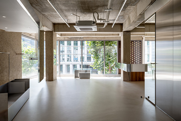
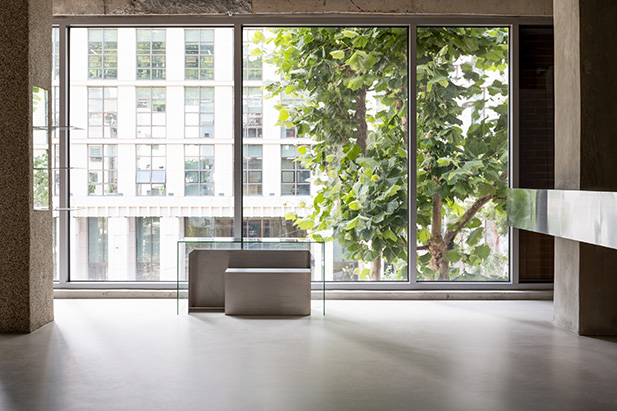
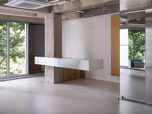
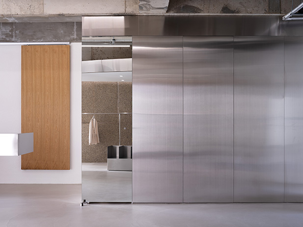
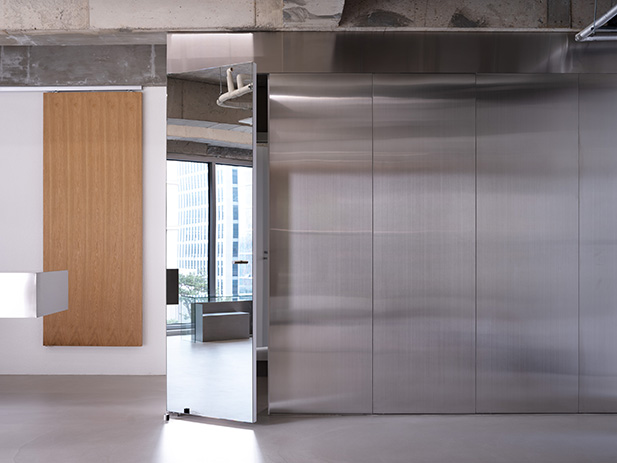
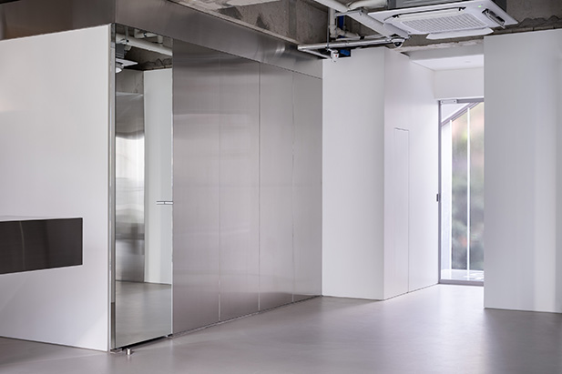
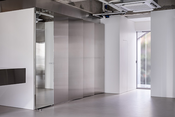
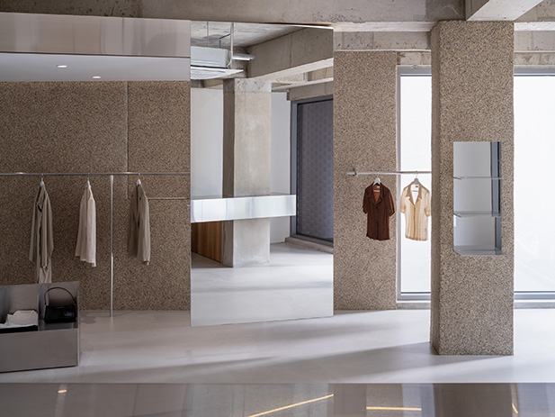
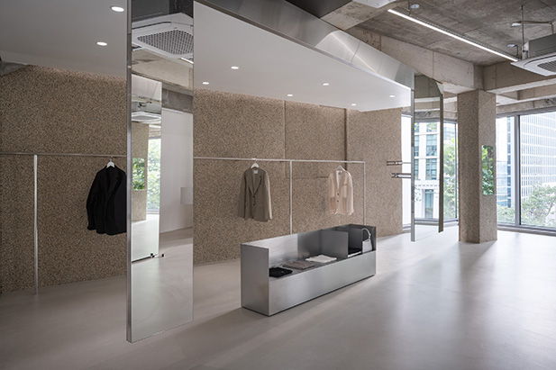
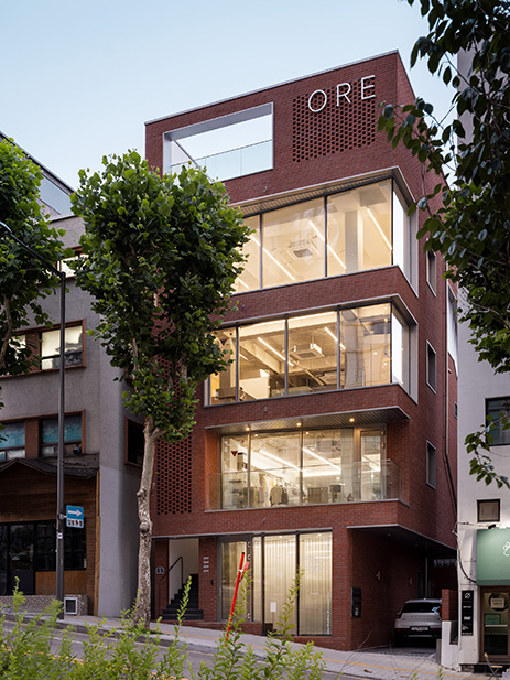
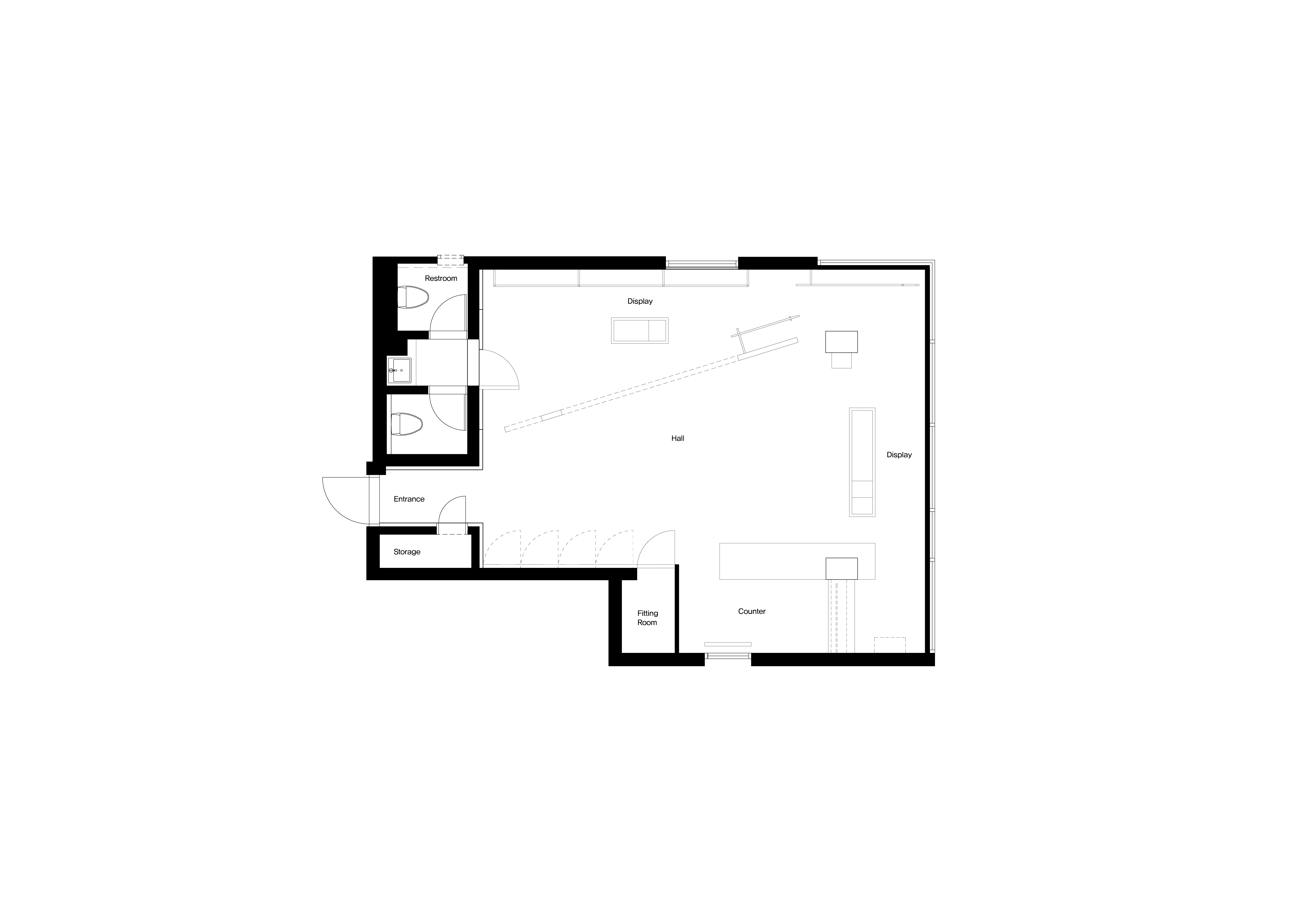
The most important point of the project was to bring the green landscape from the outside into the interior in abundance. Since the given space was composed of a whole window, the external landscape was visible at a glance, so the display zone was mainly implemented at the edge of the space and natural flow was prepared so that people could enjoy the scenery and look around leisurely. In addition, the spatial feeling is very three-dimensional even though it is a minimal mood by using spatial elements mainly in formations that emphasize straight lines and to coolly cross or intersect the open interior. When you enter the entrance, the display zone, which looks like it is floating in the air, empties a part of it, stretches to the left and leads you to walk. It is interesting to creatively combine consistent formative languages, such as creating a mirror from the ceiling or connecting thin line shelves between walls, with smooth and glossy materials being constructed to create a natural landscape and an interior view from the outside. In addition, the counter facing the display zone adds a dizzying sensation in a narrow and long form that completely empties the bottom. As a result of implementing the structure by focusing on reinforcement, it succeeded in creating a bold balance by combining large vertical and horizontal lines. The display zone and counter, which combine structural aesthetics, are more meaningful as they are motifs on the bridge of Lake Towpath, and reveal the identity of the shop while subtly describing the scenery.

프로젝트에서 가장 중요한 점은 외부의 푸르른 경관을 내부로 풍성하게 들여오는 것이었다. 주어진 공간은 전면이 통창으로 구성돼 외부 조경이 한눈에 들어오는 형태였기에, 공간 가장자리에 중점적으로 디스플레이 존을 구현하고 자연스럽게 흐르는 동선을 마련해 사람들이 풍경을 감상하며 여유롭게 둘러보도록 신경 썼다. 아울러 직선을 부각한 조형 위주로 공간 요소를 삼고 탁 트인 내부를 시원하게 가로지르거나 교차하게끔 구성해 미니멀한 무드임에도 공간감은 무척 입체적이다. 입구에 들어서면 일부를 비워 공중에 붕 뜬 것처럼 연출한 디스플레이 존이 좌측으로 길게 뻗어 발길을 이끈다. 매끄럽고 광택 있는 소재를 넓게 시공해 외부에서 들어오는 자연 풍경과 내부 전경을 품어내는데, 천장에서 거울을 떨어뜨리는 형태로 제작하거나 가느다란 라인 형태의 진열대가 벽 사이를 잇게 하는 등 일관된 조형 언어를 창의적으로 조합한 점이 흥미롭다. 아울러 디스플레이 존과 마주한 카운터는 하부를 완전히 비워낸 좁고 긴 형태로 아찔한 감각을 더한다. 보강에 집중해 구조를 구현한 결과 수직 수평의 굵직한 라인이 맞물려 과감한 밸런스를 이루게 만드는 데 성공했다. 이처럼 구조적 미학을 집약한 디스플레이 존과 카운터는 Towpath 호안의 다리에 모티브를 둔 것으로 더욱 뜻깊으며, 그 풍경을 은근하게 묘사하면서 숍의 아이덴티티를 드러낸다.


Design : STUDIO GIMGEOSIL
Location : Huam-dong, Yongsan-gu, Seoul
Site area : 80㎡
Completion : 2021
Photographer : KIM DONG KYU
'Interior Project > Retail' 카테고리의 다른 글
| Starfield Coex Mall Renewel (0) | 2023.05.11 |
|---|---|
| Fuzhou Vanke Golden Field of International Reception Center (0) | 2023.04.21 |
| CHEONGDAM WATCH (0) | 2023.04.13 |
| Gajo Space (0) | 2023.04.07 |
| All That Jazz (0) | 2023.03.20 |


마실와이드 | 등록번호 : 서울, 아03630 | 등록일자 : 2015년 03월 11일 | 마실와이드 | 발행ㆍ편집인 : 김명규 | 청소년보호책임자 : 최지희 | 발행소 : 서울시 마포구 월드컵로8길 45-8 1층 | 발행일자 : 매일