When a long-established jewelry store prepared to make the move to a better-trafficked location, the owners saw an opportunity to embrace a new look that would appeal to a fresh generation of shoppers. While they wanted the new retail environment to honor their established customer base, they also hoped to appeal to new customers and current tastes. Toronto-based design firm Cecconi Simone Inc. set out to create a harmonious and timeless design within the 3,500-square-foot retail space, envisioning an aesthetic that was both sophisticated and approachable. A luxurious backdrop would showcase both the store’s own popular product line and a range of other brands, with a simplified display area, a warm black-and-white color palette, and rose-gold metal accents for a hint of color.
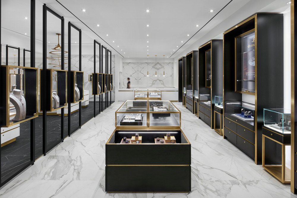
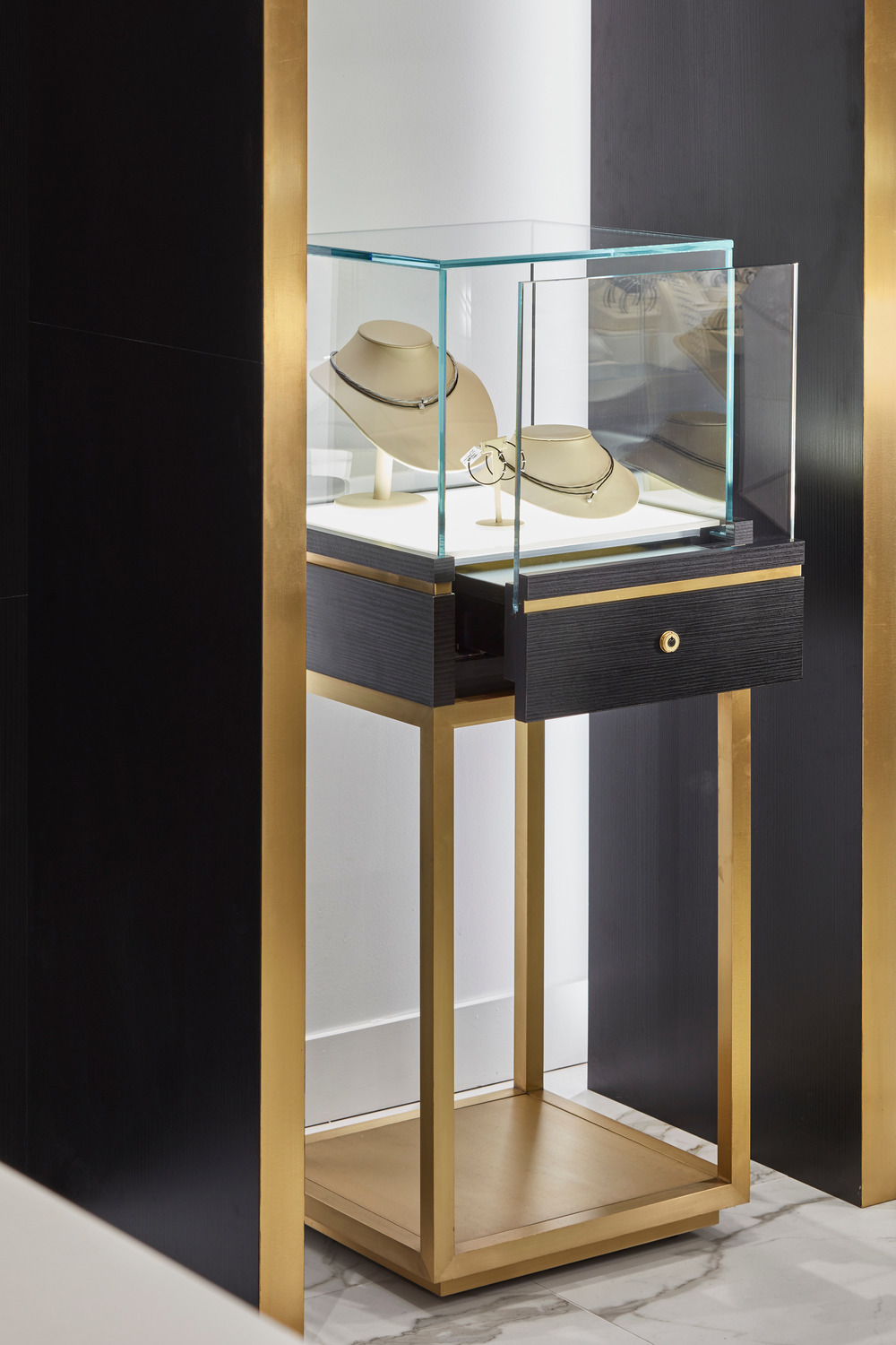
“Jewellery stores can traditionally feel over-cluttered, with brands and products competing for attention. Our challenge was to create a visual style that was simple and minimalistic, bringing focus to the stunning jewelry on display,” says Cecconi Simone principal Anna Simone. “To accomplish that, we installed custom jewelry cases and employed contrasting tones that carry the eyes to key focal points. The result is sophisticated but not intimidating – and makes the jewelry the star.”
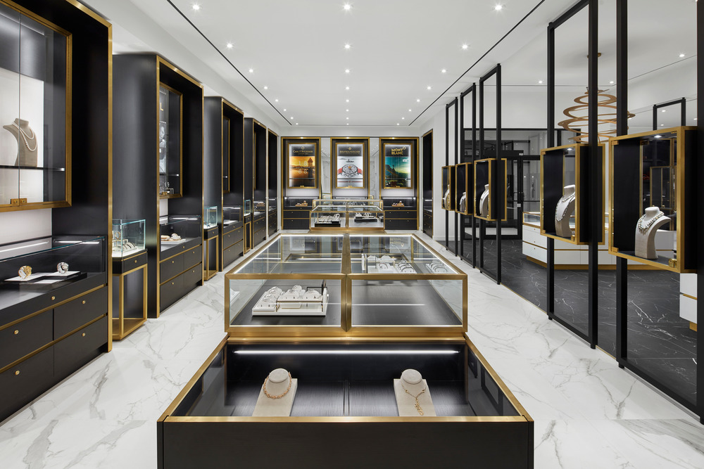
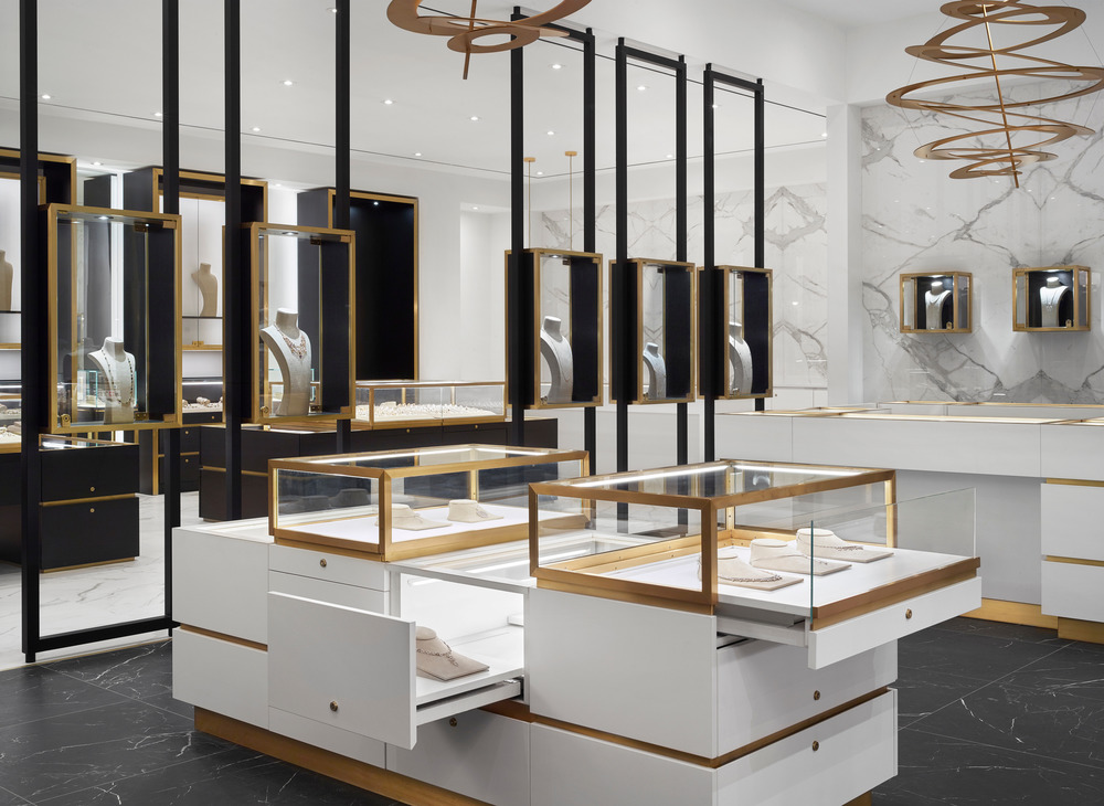
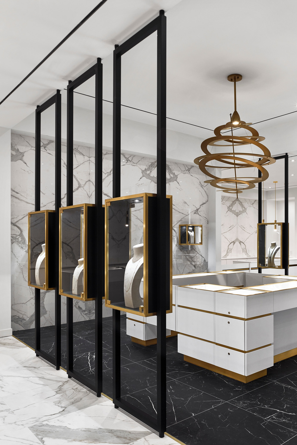
A monochromatic white-on-white zone draws eyes first, forming a spine through the center of the shop and acting as a backdrop for featured displays. On either side, black-on-white zones lead shoppers through, inviting them to peruse both the store brands and those they support. Custom wood-and-glass cases create continuity throughout – treating the jewelry like art in a gallery and removing the clutter of competing brand marketing – while rose-gold metal highlights both the display cases and accent lighting. The same metal twists like a delicate necklace through a dramatic focal-point light fixture above, drawing eyes to a fixture that feels like a piece of jewelry itself. Combined, the high-contrast aesthetic creates a sense of balance and rhythm, but the design doesn’t immediately give everything away. Rather, shoppers are invited to come in and explore all the secrets on display, opening up opportunities for one-on-one interactions with staff.
“The shop’s owners embrace a warm and personalized sales approach, and our aim was to create a space that both represents and supports that,” Simone says. “We think that we succeeded. The aesthetic feels warm and welcoming and encourages people to linger as they deliberate on what can often be a costly, once-in-a-lifetime decision like purchasing an engagement ring.” To accommodate the different types of shoppers that will ultimately visit the store, the design also features a social lounge where shoppers can sit down with a cup of coffee and engage in conversation, as well as a diamond room where they can be left alone in private to deliberate. There’s even an Instagram wall – providing the perfect backdrop for selfies and photos to share with friends. “The space is luxurious but not overwhelming, and respects the fact that people have different ways of shopping,” Simone says. “We designed it to give everyone the opportunity to interact however they feel most comfortable.”

오랜 역사를 자랑하는 보석상점이 교통량이 많은 곳으로 옮길 준비를 하자, 주인들은 새로운 세대의 쇼핑객들에게 어필할 수 있는 새로운 모습을 받아들일 수 있는 기회를 얻었다. 새로운 환경이 그들의 기존의 고객을 존중하기를 원하면서도 새로운 고객들에게 어필하기를 원했다. 토론토에 본사를 둔 디자인 회사인 Cecconi Simone Inc.는 325.16㎡의 공간에서 세련되고 접근하기 쉬운 미학을 구상하면서 조화롭고 시대를 초월한 디자인을 만들기 시작했다. 고급스러운 배경은 매장 고유의 인기 제품 라인과 다양한 브랜드를 선보이게 되는데, 간결한 디스플레이 면적, 따뜻한 흑백 컬러 팔레트, 로즈골드 메탈 악센트가 어우러져 색감을 느낄 수 있다.

"보석상점은 전통적으로 브랜드와 제품이 관심을 끌기 위해 경쟁하는 등 복잡함을 느낄 수 있습니다. 우리의 과제는 단순하고 미니멀한 비주얼 스타일을 만들어 전시된 멋진 보석들을 집중 조명하는 것이었습니다."라고 건축가는 말한다. "이를 위해 우리는 맞춤형 보석 케이스를 설치하고 주요 초점으로 시선을 전달하는 대비 톤을 사용했다. 결과는 세련되지만 위협적이지는 않으며 보석을 스타로 만들어 준다.
단색의 화이트 온 화이트 존이 먼저 시선을 사로잡고, 매장 중앙을 관통하는 척추를 형성하며 피처링 디스플레이의 배경 역할을 한다. 양쪽 모두 블랙 온 화이트 존이 쇼핑객들을 안내하며, 매장 브랜드와 그들이 지지하는 브랜드 모두를 정독하도록 한다. 맞춤형 목재 및 유리 케이스는 갤러리에서 보석을 예술처럼 취급하고 경쟁 브랜드 마케팅의 혼란을 제거하는 동시에 디스플레이 케이스와 액센트 조명을 모두 강조한다. 동일한 금속이 위의 극적인 초점 조명 기구를 통해 섬세한 목걸이처럼 비틀어지며 보석 자체처럼 느껴지는 기구로 시선을 이끈다. 높은 대비의 미학이 조화를 이루어 균형감과 리듬감을 자아내지만, 디자인이 모든 것을 바로 드러내고 있지 않다. 오히려 고객들을 불러들여 전시된 모든 비밀을 탐색함으로써 직원들과 일대일로 교류할 수 있는 기회를 열어준다.
건축가는 "이 가게의 주인들은 따뜻하고 개인화된 영업 방식을 수용하고 있으며, 우리의 목표는 이를 대변하고 지원하는 공간을 만드는 것이었습니다."라고 말한다. "우리는 성공했다고 생각합니다." 미학적으로 따스하고 반가운 느낌이 들며, 약혼 반지를 구입하는 것과 같이 종종 비용이 많이 드는 단 한 번의 결정을 고민하는 동안 사람들이 머물도록 격려한다. 궁극적으로는 매장을 찾는 다양한 유형의 고객들을 위해 커피 한 잔을 들고 앉아 대화를 나눌 수 있는 소셜 라운지와 혼자만의 시간을 가질 수 있는 다이아몬드 룸도 디자인됐다. 심지어 인스타그램 벽도 있어 셀카와 사진을 친구들과 공유할 수 있는 완벽한 배경을 제공한다. 건축가는 "공간은 호화롭지만 압도적이지는 않으며 사람들이 쇼핑하는 방식이 다르다는 사실을 존중한다"며, "우리는 모든 사람이 가장 편안하게 느낄 수 있는 상호 작용의 기회를 제공하기 위해 설계했다."라고 말한다.

Interior design Cecconi Simone Inc.
Location Toronto, Canada
Building area 325.16㎡
Completion 2019
Millwork Unique Store Fixtures Ltd.
Photographer Shai Gil
'Interior Project > Retail' 카테고리의 다른 글
| Headfoneshop (0) | 2021.08.11 |
|---|---|
| JEWERLY SHOP DD GOLD (0) | 2021.08.10 |
| Kki Sweets and The Little Dröm Store (0) | 2021.08.03 |
| Toyou bookstore (0) | 2021.07.21 |
| Uvée - Optometry Clinic (0) | 2021.07.15 |


마실와이드 | 등록번호 : 서울, 아03630 | 등록일자 : 2015년 03월 11일 | 마실와이드 | 발행ㆍ편집인 : 김명규 | 청소년보호책임자 : 최지희 | 발행소 : 서울시 마포구 월드컵로8길 45-8 1층 | 발행일자 : 매일