The Chang Residence

The Chang Residence is located at a residential area in central Taipei. Although its interior area was only 76 square meters, its square structure was used to create a symmetrical layout, allowing us to evoke a sense of orderliness and openness.
In terms of spatial distribution, the design opens up the entire public area, replacing partitions with exposed structural beams and columns, allowing for fluid distinctions between the living area, restaurant, and kitchen. Hidden behind a walnut wall is the bedroom and bathroom. We aimed to maximize natural lighting while maintaining privacy. Moreover, the directions of partition walls were adjusted to minimize the obstruction of natural light. The central area of the interior, where natural light is weakest, features stainless steel door leaves that help scatter light from the front and back windows, keeping the space bright.
In the modern city urban jungle, every square inch of space usage is the result of a committed calculation, yet we all seek to insert a comfortable and private resting place within the complex beehive like urban scene.
The project is located in a high-end residential area in the heart of Taipei city. The owner couple was in favor of a simple plan dwelling and hoped to enjoy an open feeling in their lives. In respond to their expectations of simplicity and return to the original functionality, we reorganized the spatial structure, integrated the walls of the public areas and opened up the living space, dining room and kitchen to create a bright and open appearance.
About Symmetry
We pointed out that there were three considerations in the overall planning: first, the building front is in close proximity to other buildings, and the rear side is the back of the adjacent buildings so both orientations were not ideal for natural lighting. Therefore, by reorganizing internal plan layout as a starting point, removing no longer needed walls and reorganizing old utility lines, the overall layout now allows front and rear lighting to penetrate into the home. Additionally, the building footprint is a fairly symmetrical square shape, but with a low floor to floor height and deep beams, so it was important to levitate the ceiling plane to avoid the low oppressive feeling, The design put emphasizes on the sense of transparency of space construction to offer a neat and open visual experience. and uses the square characteristics of the interior structure to promote a "symmetrical" layout. This made the public area as open as possible to maintain the smooth flow of sight and circulation.
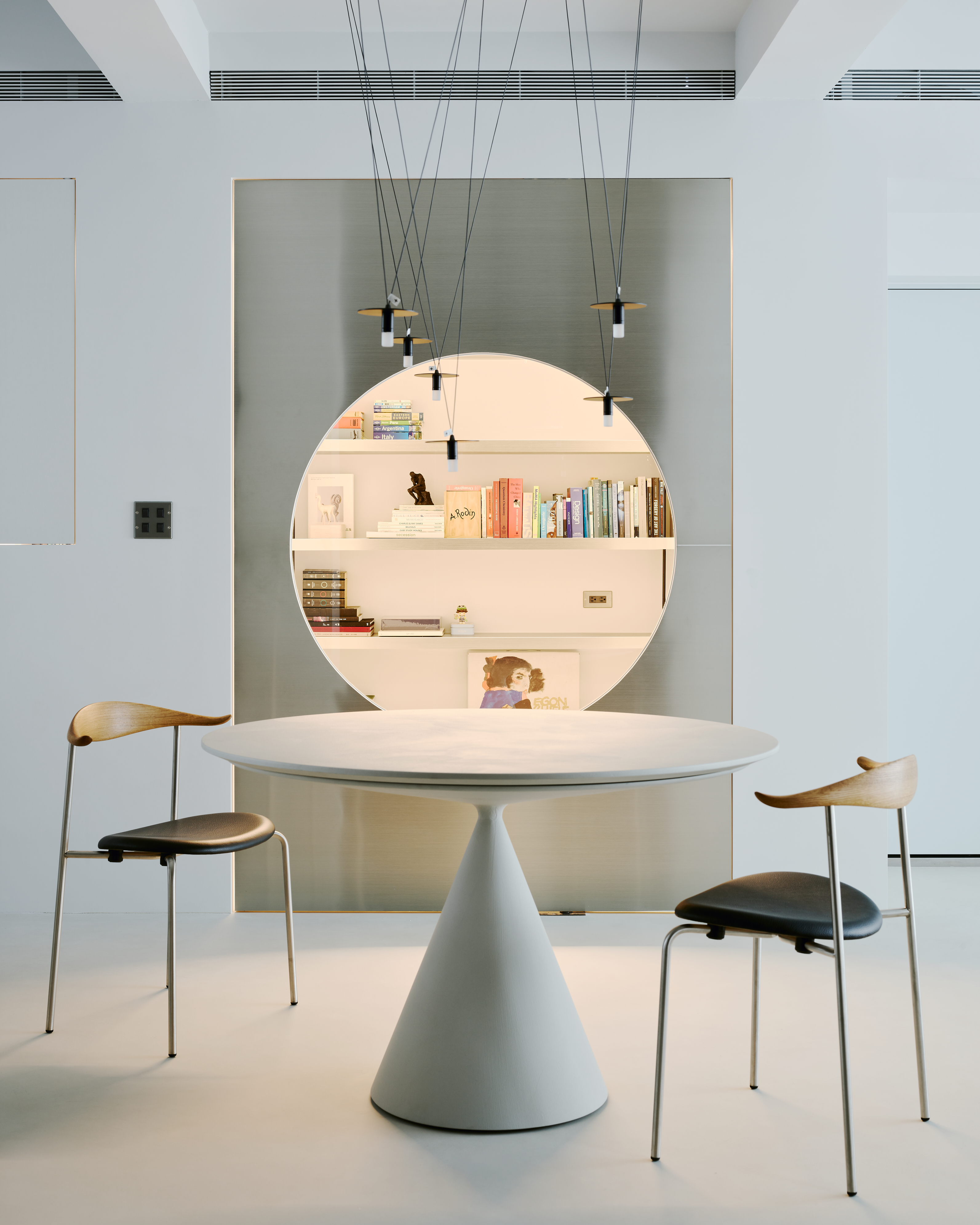
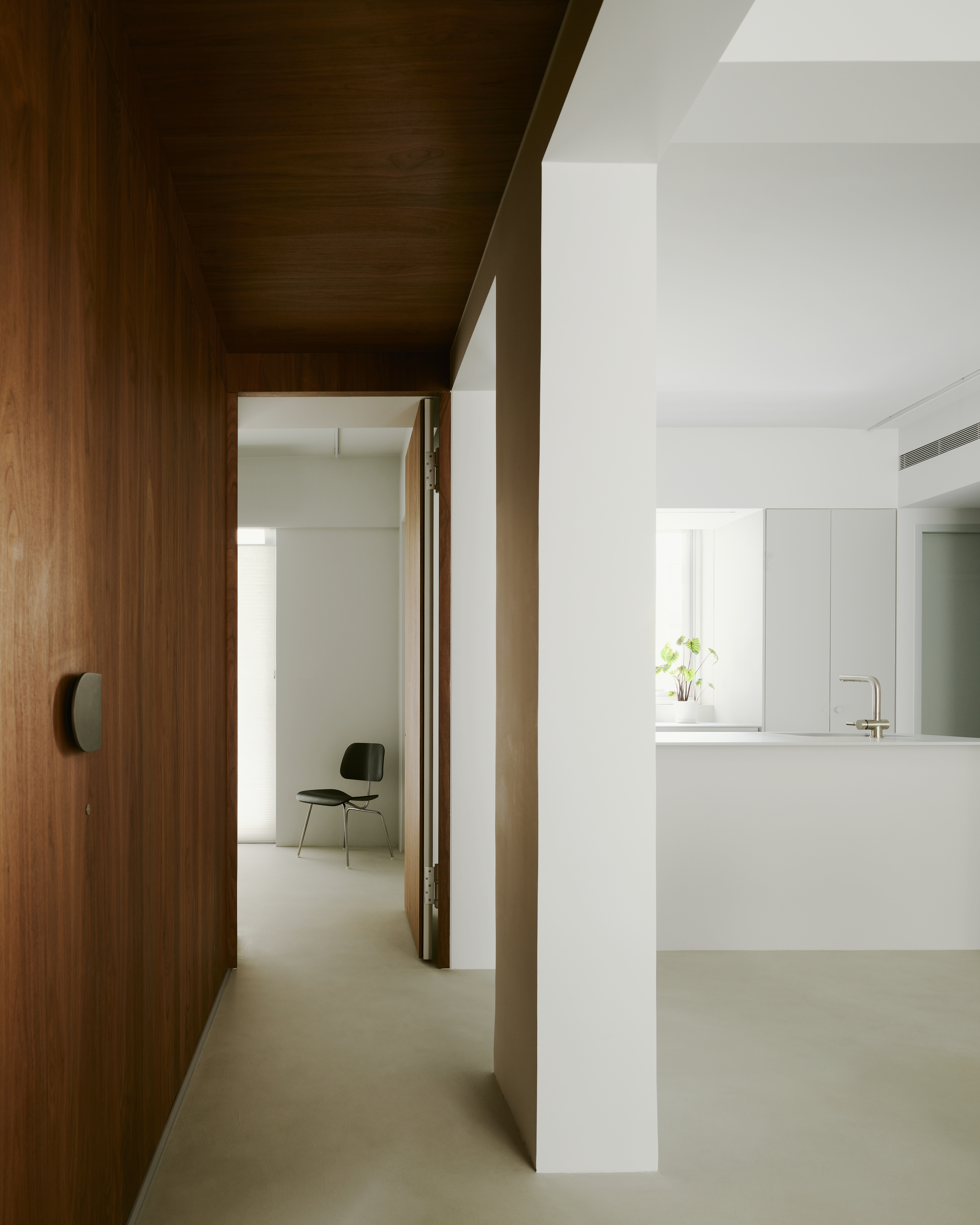
Thirdly, there are two existing load-bearing columns situated between the private and the public area, and how to maintain a smooth circulation flow was another design focus. We referenced atrium design to feature the columns of the corridor that extends into the bedroom area by adding a transitional zone with a transparent corridor and the exposed ceiling to lessen the visual oppression. It also turned the existing structural elements into a frame to form a symmetrical demarcation. This highlights the symmetrical characteristics centered on the dining area, and constructs a neat, orderly, open and bright visual experience for the interior.
Elegance in order
The whole project consists of simplicity and elegance in depth. The overall gray tone background sets a clear and light tone, and the use of the texture and color of materials highlights the interior layout and structural characteristics. That finish materials used in each space are intentionally slightly different, but all implement a simple temperament.
The left and right sides of the dining room correspond to the bedroom corridor and the study room with the two areas in contrast through different tones. This study is reserved for the owner, an independent space without interference, and a small window in the room facilitates communication with the family.
The study room with a stainless steel finished revolving door, was deliberately widened to cope with the symmetrical frame of the cloister columns., A door piece was added with a round moon window to achieve the effect of extending the line of sight from the inside of the room out. The stainless steel finish panel helps diffuse the light but maintains the brightness of the interior space.
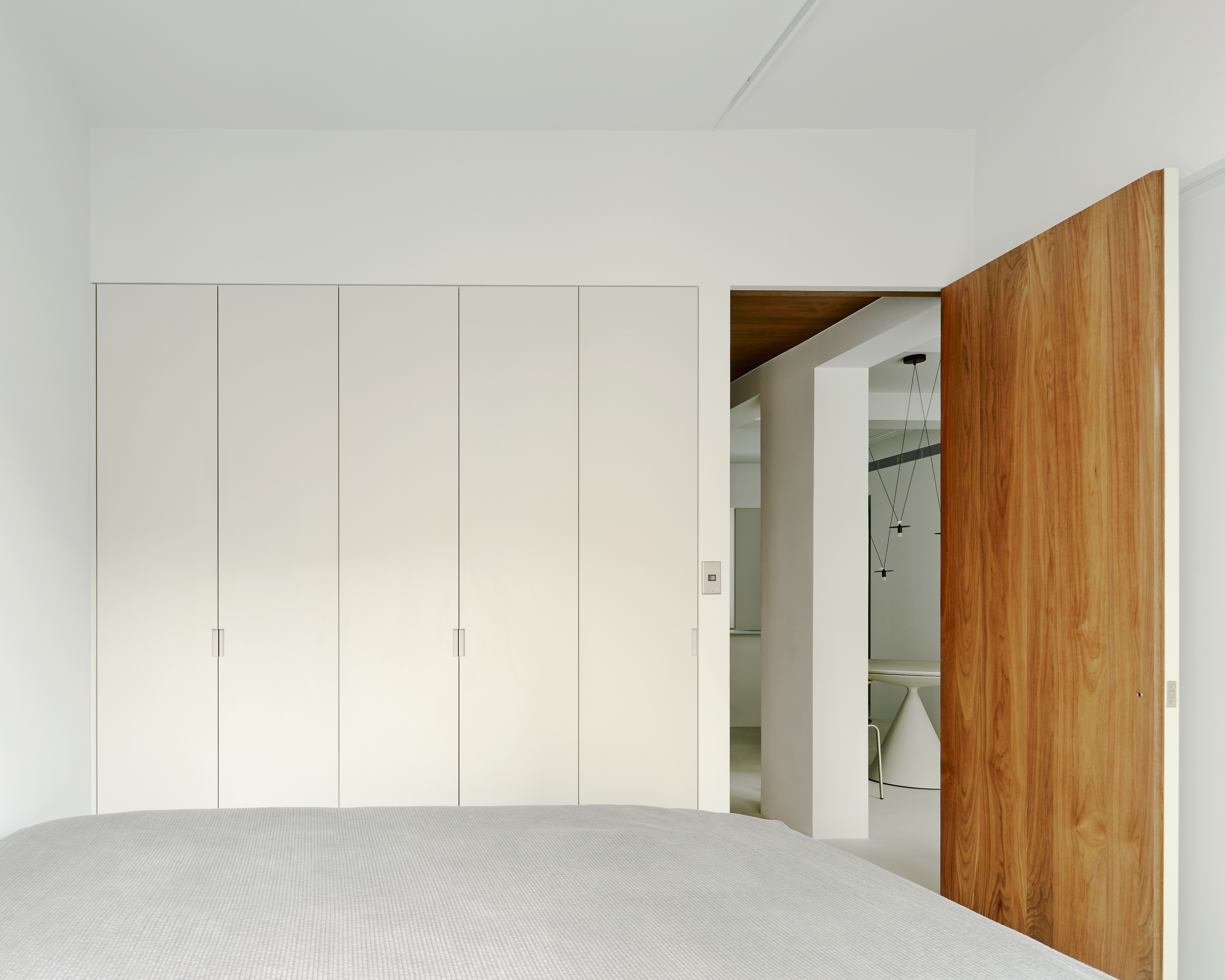
The ceiling and elevation of the bedroom corridor area are finished with a walnut wood veneer to reduce the coldness of the space. We intentionally concealed the bedroom and bathroom doors in the wall to hint at the private attributes of this area. The two bedrooms are placed at the left and right ends of the corridor area to include the guest bath space. The consistent warm tone elevation contrasts with the gray space to highlight the permeability of the spatial structure and the relationship between beams and columns.


디자이너 2BOOKS DESIGN
위치 Taiwan, Taipei city
연면적 76㎡
대표디자이너 Jeff Weng
디자인팀 Lina Lin
건축주 Mr.Chang
사진작가 Studio Millspace